

LIGATURE JOURNAL – The Story
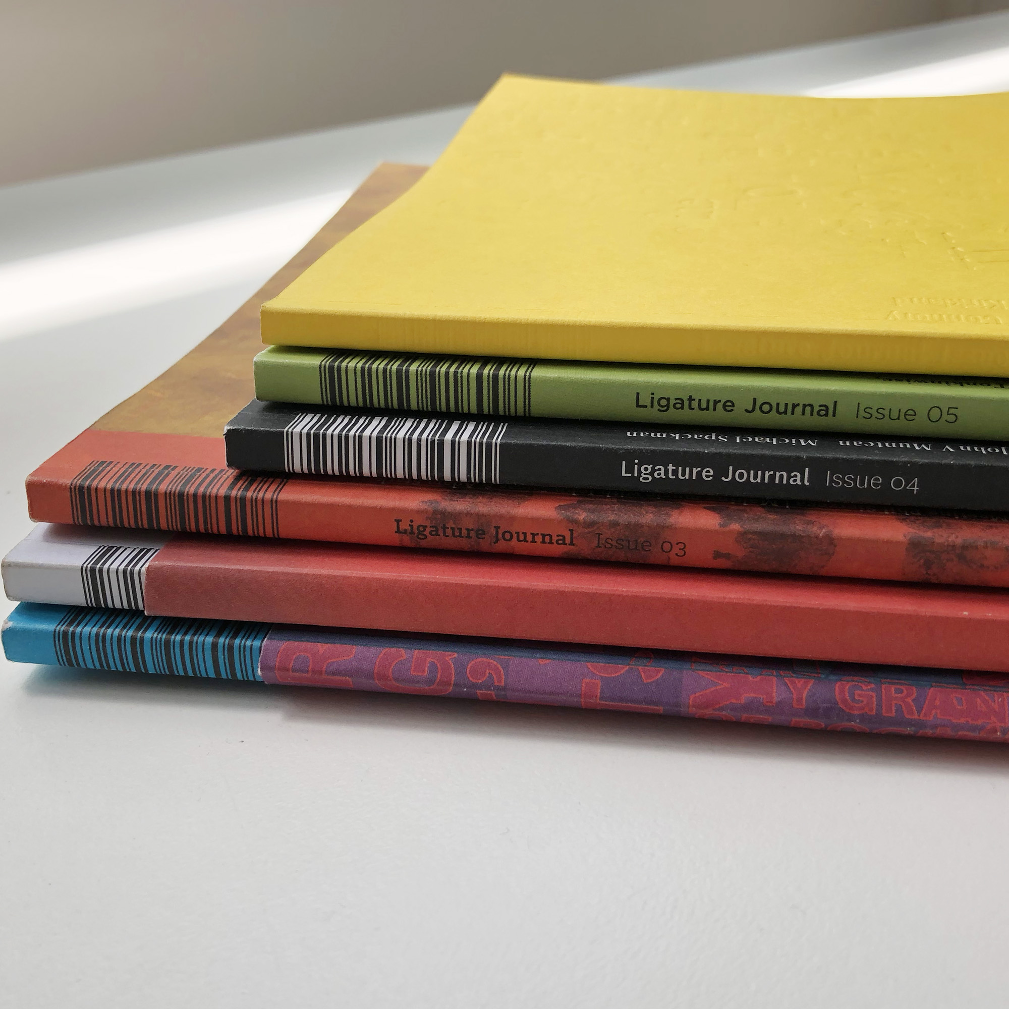
Ligature Journal first appeared with issue Zero in December 2015 and a further ten issues appeared once or twice a year until late 2021. Copies of all issues are still available in limited numbers as are a few items of merchandise that were created in conjunction with select issues
The magazine, in its content, was intended to be the printed voice for a community of people in Australia who are interested in design and the thinking that goes into design. At the time of it’s creation, and continuing to this day, there was and is no native Australian cross-disciplinary design magazine that looks at the thinking behind design (as opposed to being a vehicle for advertising of industry related product).
The magazine’s method of production was essentially a teaching and industry experience project. As such students from various design schools were involved in the design, (to some extent) sourcing of content and production of the issues. A different team came together for each issue and developed a template and visual framework from scratch with only a very limited number of continuing constraints, in complete opposition to how magazines are usually produced. This gave each issue a unique flavour while arguably being a dynamically related collection of issues.
In many respects the magazine was successful in its endeavour. Approximately 110 students were involved in the designs and at least within the graphic design industry the design work was recognised in competition. Note, that the designers were students but the magazine in the professional categories you can see below which is quite an achievement. The magazine was never financially viable and it was never really intended to be. For the core team of Felix Oppen and an assistant it was also a lot of work, which only became more difficult when Covid hit during the last couple of issues. The financial drain and creative burnout become too much. As a result the decision was made to cease publication.
Ligature Journal has received the following industry recognition:
Issue 10—Real Media Awards 2021/22 WINNER Creative Design & Execution
Issue 9—AGDA Awards 2020 MERIT (Publications – Whole magazine)
Issue 8—AGDA Awards 2020 MERIT (Publications – Whole magazine)
Issue 7—AGDA Awards 2020 MERIT (Publications – Whole magazine)
Issue 10—AGDA Awards 2022 Finalist (Publications)
Issue 9—AGDA Awards 2020 Finalist (Publications – Cover Only)
Issue 8—AGDA Awards 2020 Finalist (Publications – Cover Only)
Issue 7—AGDA Awards 2020 Finalist (Publications – Cover Only)
Issue 6—AGDA Awards 2019 Finalist (Publications – Whole magazine )
Issue 6—AGDA Awards 2019 Finalist (Publications – Cover Only)
Issue 5—AGDA Awards 2018 Finalist (Publications – Whole magazine)
LIGATURE JOURNAL: CONNECTING THINKING AND DESIGN
MANIFESTO
THE ONLY MAGAZINE OF ITS KIND
We are the printed voice for a community of people who are interested in design and the thinking that goes into design. A community that expresses itself through design, that celebrates and explores the ideas that inform and connect design across a multitude of disciplines.
As designers we need to look beyond the borders of our own disciplines in our search for inspiration and information. In Ligature Journal, you will find offerings from within a variety design practitioners butted up together providing the potential for a cross-fertilisation of ideas, thinking and inspiration from one discipline to another.
CONNECTING THINKING AND DESIGN
We are also a teaching tool, each magazine is designed by a fresh design team composed of graduates and final year students from universities and colleges from all across Sydney. We aim to challenge and push not only our team, but our readers as well.
THE THREE BONDS
Ligature (typography): a combination of two or more letters into a single symbol Ligature (printing): a stroke or bar connecting two letters Ligature (general usage): anything that serves to bond or tie two things together.
Bond one: Ligature Journal is a publication for anyone who loves design. Whether designer or non-designer, reader or contributor, we invite you to discover and examine design in all its forms. We hope to challenge, inspire and inform you, but most importantly we want to celebrate design and the people who practice it. If you want a deep-dive into the issues of design, if you want to explore the potential and possibilities of design—its ethics, philosophies and impact—please join us!
Bond two: We live in a world of curated feeds and niche marketing, which is fine as far as it goes. But as designers we need to look beyond the borders of our own disciplines in our search for inspiration and information. In Ligature Journal, you will find offerings from within a variety design practitioners butted up together providing the potential for a cross-fertilisation of ideas, thinking and inspiration from one discipline to another. To provide an organisational framework—to make our lives easier—we have chosen to group the many design disciplines in the following loose categories— Communication (including graphic and digital design; design that employs words and images), Experience (including design that affects us in intangible ways), Object (including industrial, product and fashion design; the design of things we use, hold and wear), and Spatial (including architecture, environmental, landscape and interior design; the design of the environments in which we move).
Bond three: Ligature Journal is an ongoing collaboration between Tiliqua Press and a small group of highly motivated final year students and/or recent graduates from the communication design programs of tertiary institutions in Sydney, Australia. To date we have engaged emerging designers from Billy Blue College of Design (Torrens University), University of Technology, Sydney, UNSW Art & Design, Western Sydney University, Enmore Design Centre (TAFE) and Shillington College. What we provide is a bridge between college and industry—guided experience in editorial design, typography, image creation, and the issues surrounding design for print. The skills these young designers acquire or build on translate to most forms of communication design, both print and digital. While the journal benefits from their enthusiasm, energy and fresh viewpoint, these young designers get real-world experience in the challenges and rewards of their chosen industry under the mentorship of experienced designers. For each issue, the path the designers take begins with 90-odd blank pages and ends with the finished issue: from the development of an editorial design template (grids, type and colour palettes), through the sensitive application of that template to the layout of individual articles, to pre-press preparation and finally a press check at the printers. Read about all the issues. The journal is an initiative of, and owned by, Tiliqua Press. Issues are released by Tiliqua Press, and can be purchased from the Tiliqua Press online store.
Tiliqua Press, the publisher of Ligature Journal, acknowledges the Gadigal people of the Eora Nation, the traditional owners of the land and waters upon which our premises stands.
Why Ligature Journal was created
By founder Felix Oppen
There are three elements to the origin of the Journal, though I would have to say that the real beginning of the Ligature Journal story is entirely personal. I have had a desire to create and produce a magazine for many years. Maybe it was just vanity, to get something over which I had a lot of control – something not subject to the needs of an external client – into the world.
An object that allowed me to present my view of the world of design that others may find interesting. In addition to this there was perhaps an almost Luddite reaction to the ever increasing penetration of the digital world into my practice, more and more of what I was doing never left the realms of the digital world and dammit I liked to hold things, touch the work I made, interact with it in ways that the generic keyboard/screen did not allow. So, this was the first element, an underlying feeling/foundation that was present when the opportunity to put together a magazine arose.
Element number two was the cancellation of another magazine. I began teaching at Billy Blue College of Design in 2008 and at that time, once a year, a magazine called BBetween was being produced. The brainchild of the then Head of School, Andrew Barnum, it was produced outside of the teaching curriculum by a group carefully selected final year students. From about 2011 I had become interested in working with the students on the publication and was angling for a spot on the teaching team. Then suddenly during a time of upheaval during which the college was sold to an overseas private education provider, BBetween was cancelled. The cancellation was sudden enough that the design of the last issue (number seven) had been completed and was about to go to the printers. So, while it was designed it was never released and except for a low-res version that only a few people still have.
The thing about this magazine was that there a very few commercially released publications that young designers get to work on, to design, to learn from, certainly of that length. Even now very few if any tertiary communication design teaching programmes have editorial design projects of this size and complexity. However, industry still needs graduates with experience in this kind of design, print publishers still exist and online publications also have a use for editorial publishing skills. This is the third element of the origin story, that I realised that there was a need for a teaching publication that gave students and recent graduates an opportunity to gain skills in an area needed by the design industry.
In 2014 I began talking with Billy Blue about the possibility of reviving a magazine for students to work on, run and funded as an external client project. Then in early 2015 I set up a publishing company, Tiliqua Press, and registered the business name Ligature Journal. After some 18 months of negotiation we began work on the first issue, number issue zero because it was a trial issue, as part of the teaching programme of the college. This issue was eventually released into the market in December of that year. The next two issues (nos. one and two) were also created wholly within the college programme. The issues were produced over two terms with up two 23 students working on an issue.
Due to changes within the college communication degree structure, the publication moved to a full internship format run from the studio of Tiliqua Press. As a result of this we have up to six interns per issue. These interns can be students or recent graduates and applications are open to young designers from any of the communication design programmes run in Sydney—aside from Billy Blue we have now had interns who have studied at UTS, WSU, Enmore TAFE and Shillington College. The value of this is that not only do interns gain editorial design experience but they also some experience of working within the design studio environment. They get to meet, work with and establish industry relevant connections with people from design programmes other than their own. In this world where community is perhaps more important than ever this is no bad thing.
A little extra insight into Ligature Journal themes
A little extra insight into Ligature Journal … The world of design is vast and enthralling. One of the many challenges facing the editorial team at Ligature is how to choose a theme to explore from all the exciting possibilities out there. Once Felix (the man who dreamed up Ligature Journal) decided that we should aim for three issues a year, we conceived a scheme.
We decided on three categories, or meta-themes, to be assigned to each issue in turn – ‘mind’, ‘body’ and ‘soul’ – the three components that make up one individual person. Issue One (peak stuff) was a mind theme, Issue Two (for good) is obviously a ‘soul’ theme, Issue Three (by Hand) a ‘body’ theme and so on.
The intended focus of the meta-themes was as follows; mind – intellectual/theoretical, body – practical/physical and soul – philosophical/spiritual. These were communicated to the contributors for each issue as a guide to the direction of their writing. The meta-themes were also used by the design team as start point in the direction of each issue’s design.
In the end the three issues per year target turned out to be impossible to achieve, as the schedule conflicted with university term timetables, especially when there were students from several different institutions were involved. However, the rotating meta-themes were maintained right to the end.
This is why print isn’t dead (to us)
By the team of Issue Nine
Without fail, every team that we’ve run through the press tutorial with has expressed how refreshing and satisfying it was to design something physically from start to finish. Designers often feel super glued to their digital screens, unable to walk away from it even after the end of the business day. A fair few of us ultimately pick up a hands-on hobby to sort of counteract that—making something with your hands will always be undeniably satisfying.
This is the very reason why we’ve kept our press tutorial running team after team, it’s also just a little bit of self-indulgence on our end, we love print! The proofing press allows us the freedom to design whatever we want within the restrictions of materials we have available to us. Proofing presses weren’t meant to be used in the capacity that we use it today, they were used to do exactly as the name suggests—proofing design for mistakes before it was officially printed using a different machine. To use it to print around 900 covers (times two, three or four for different passes depending on the design) is definitely pushing the press to its limits. Who says print is dead?!
From around issue 6 we decided to incorporate the press a bit more into our magazine because why not?! We had it available to us and it was a useful teaching tool to educate our team about the origins of type terminology.
The team is first introduced to the mechanisms of the press, the limitations of it and materials that can be used. Their first task is to design a team poster using the type available to them—a mixture of metal and wooden letters. With teams that were able to design posters themselves it was interesting to see where their thought processes took them and how they designed their final posters.
With a rough idea of how the press works the team is challenged with designing the next cover, keeping in mind that issue 9 will be the final installment of our three-part series based on place and design (issue 7, 8 and 9 make up this trilogy). This is always a long process and typically doesn’t come together until the end of the magazine process.
Although this year COVID really put a spanner in the works. We had only managed to take our team to the template design stage before lockdown happened (this was around weeks 3/4) and the printing of it didn’t happen until about 8/9 weeks later. A few weeks of online Zoom meetings and lots of discussions later, we were finally able to see each other again (yay!). Our experience of the pandemic and lockdown inevitably found its way into the magazine and the cover design ultimately became an expression or reflection, rather, of our collective experience. As our designers so eloquently put it, this is their reasoning behind the cover design of issue 9…
“The pandemic prompted us to reflect not only on how we communicate with each other as a team, but also how we communicate as graphic designers with our audience. The cover was inspired by the yellow sticky note; a symbol of quick and efficient communication—an all too familiar canvas for our to-do lists, reminders, brainstorming sessions and lo-fi sketches. We chose to print this using a grid of 144 18pt em quads to signify all the parts that come together to communicate an idea. This form is also a playful nod to our neuroses as designers, because everything needs a grid, even a post-it. The ‘X’ on our sticky note is a mark of continuity as the thread that ties this issue with the Place series overall. And if ‘X marks the spot’, this tiny letter form lets our audience know that they’re in the right place, an invitation to open Issue 9 and get right into it (ideally with a nice coffee). But ultimately, we really wanted the cover to champion the uniqueness of the letterpress process, so each copy will be slightly different than the one before. The inside back cover features six haiku’s. These were written during the peak (thus far) of Sydney’s COVID restrictions, and are musings on the challenges of self-isolation, being creative during this time and generally trying to feel more okay in our homes, and our own heads. In contrast, the poetry on the back cover presents a vision of an idealised post-pandemic future. An exercise in working with constraints, this poem was created by removing parts of the haikus, whilst keeping the composition of their original typesetting. As such, the words of this poem appear in the same spot that they do in the haikus, but with most other words removed, they take on new meaning. Together, the back cover and inside back cover become a kind of ying-yang exploration of the strange circumstances under which Issue 9 was created—a time of challenges, great change and the opportunity to look toward a different future.”